Mapped flaws, scalability issues, and pattern inconsistencies across the existing product.
A system begins with a symptom
One app.
Too many
languages.
A fully scalable design system for a healthcare mobile app.
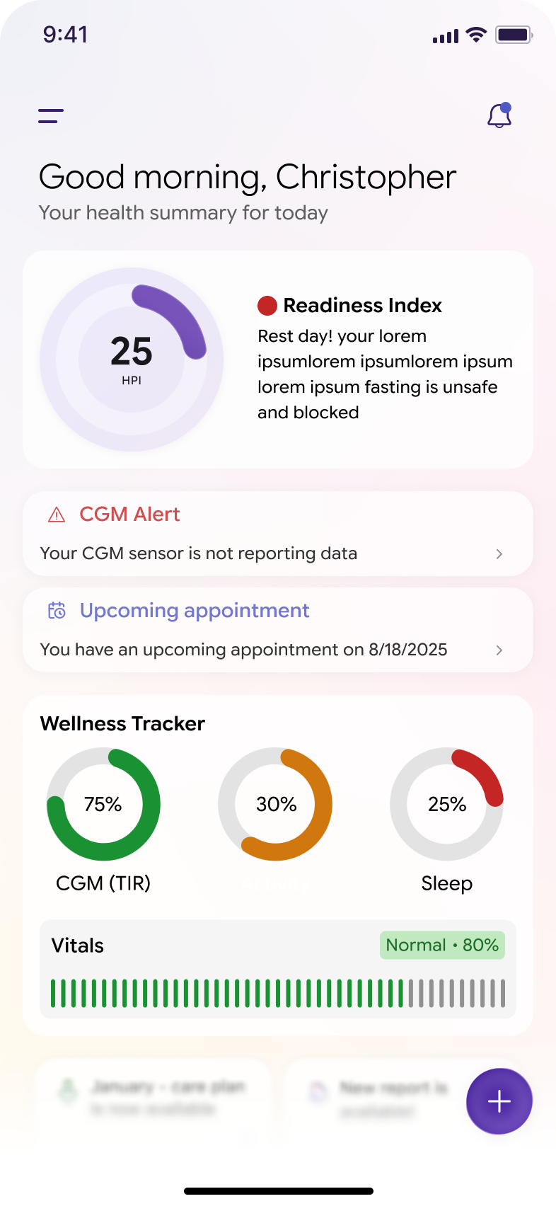
Poor UX, improper styling, and inconsistent UI patterns were affecting the healthcare mobile app experience. My role was to lead the foundational establishment of a new design language and system that could scale across mobile screens.
Follow the build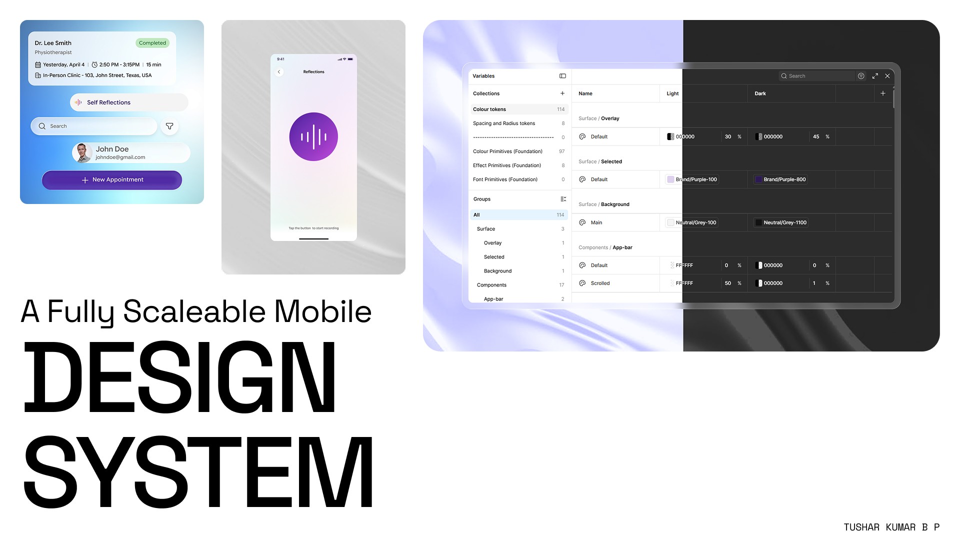
01 The fracture
The screens worked.
The product did not feel whole.
Core healthcare journeys had drifted into different rules for color, spacing, radius, hierarchy, and interaction.
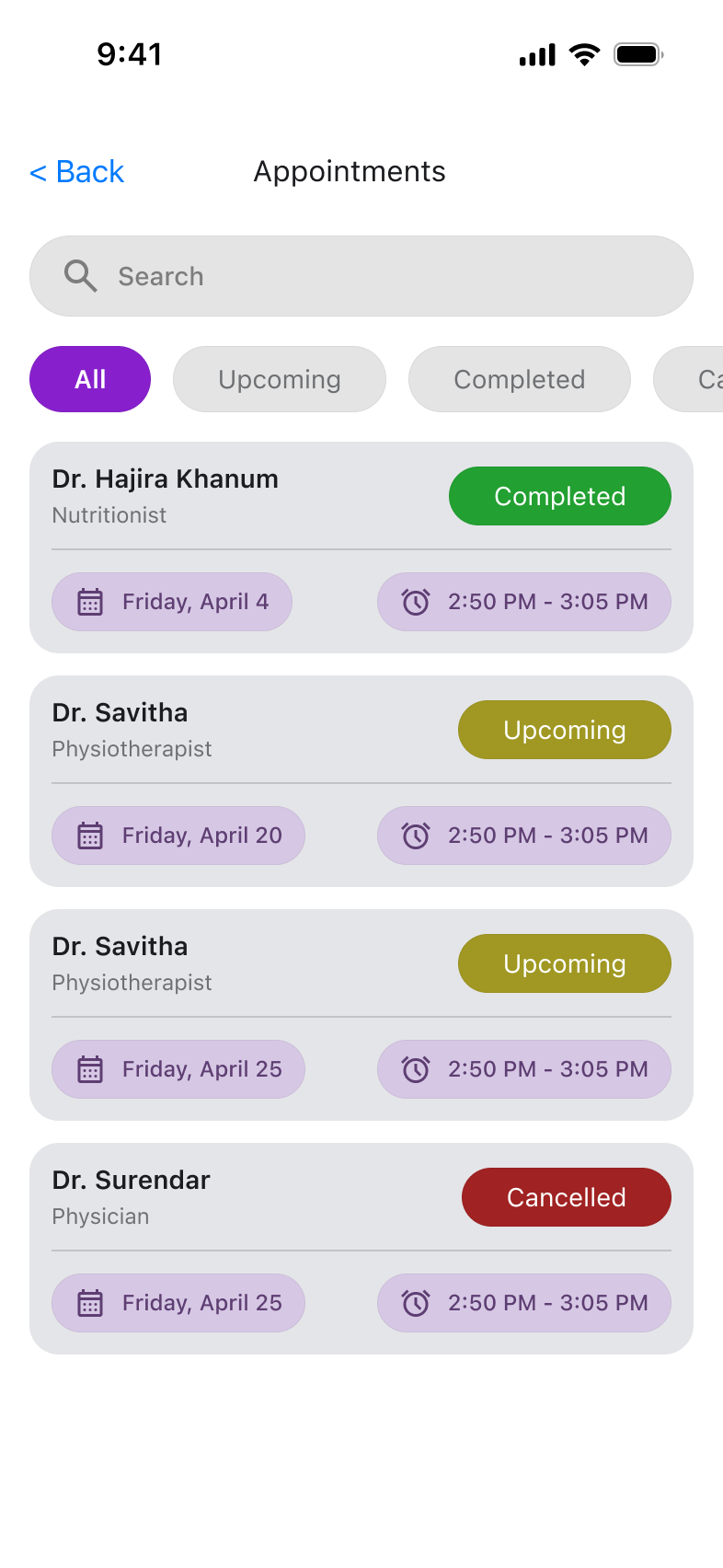
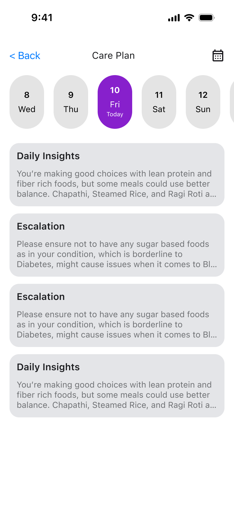
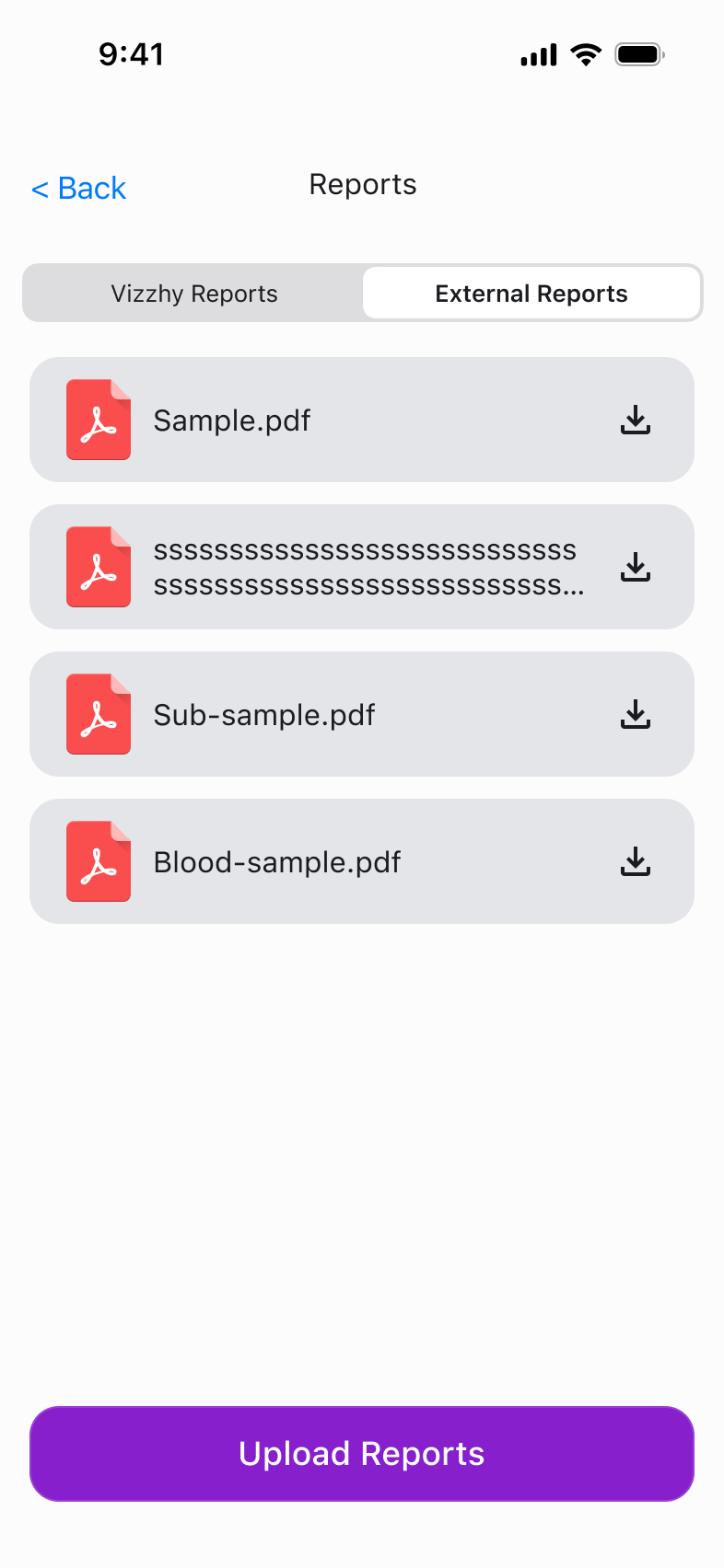
72%of negative feedback pointed to inconsistent UI patterns
01 Fragmented app language
02 Repeated design decisions
03 Accessibility and scale risk
02 The inventory
Before drawing a library,
I named the decisions.
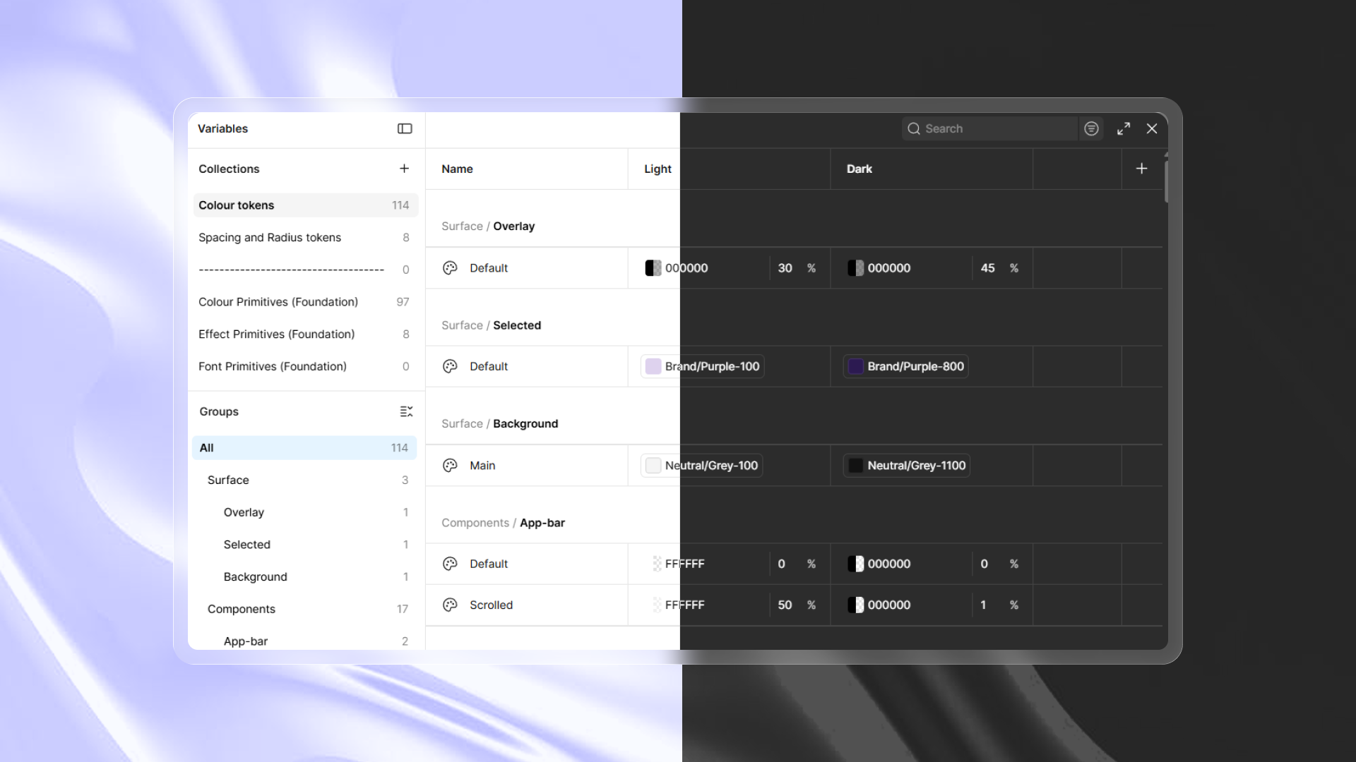
The roadmap began with research into Base, Material 3, and Apple iOS 26. I audited the app, separated primitives from meaning, and established a shared visual grammar.
Color / semantic
114organized color tokens
Space / radius
8spacing + radius tokens
Type / locale
Aa介護Health
hierarchy with CJK support
Access / themes
AA
WCAG contrast + inverse support
03 The assembly
One foundation.
Many coherent screens.
Reusable tokens, attached properties, scalable variants, adaptive sizes, themes, and interaction states became one dependable path from decision to interface.
- 01Tokensdecisions become reusable
- 02Componentsstates become predictable
- 03Patternsjourneys become coherent
- 04Documentationthe system becomes transferable
04 The operating model
A library only scales when people can use it without its creator in the room.
Structured the path that took the healthcare design system from zero to one.
Created variables, reusable components, modes, typography, primitives, and semantic tokens.
Recorded typography, spacing, effects, and color decisions for future product teams.
Led the system work alongside a fellow UX designer and a developer.
05 The proof
Consistency stopped being a design preference. It became delivery infrastructure.
50%
reduction in design-to-dev handoff time
Next The system keeps moving
From mobile library to healthcare product operating system.
Expand into appointment, profile, and care-plan flows.
Extend the light and dark foundations into accessibility and brand-level themes.
Review shipped screens against shared QA rules.
Connect Figma documentation to implementation notes.