One patient assignment. Too many disconnected systems.
AdminDashboard
Turning scattered healthcare operations into one command center.
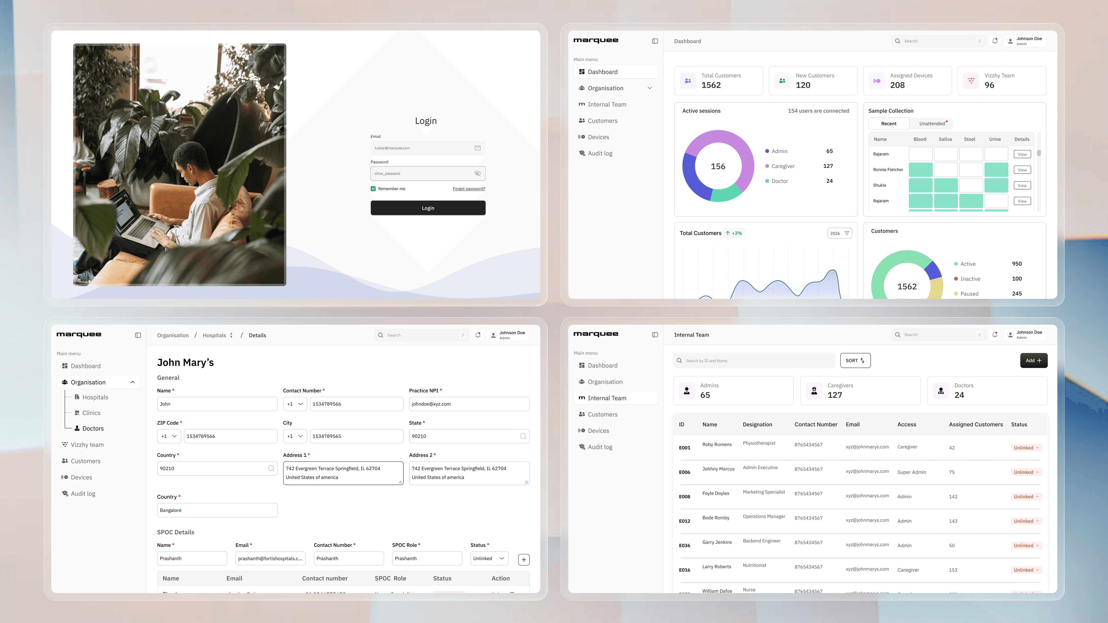
This dashboard helped admins manage customers, hospitals, internal teams, and patient assignments from one place, making status visible and routine action faster.
Follow the assignment01 / The fragmented shift
Before anyone could act, an admin had to reconstruct the truth.
A single assignment meant checking spreadsheets, Salesforce, internal databases, calendars, and email. Each surface held one part of the answer; none held the complete operational state.
PATIENT ASSIGNMENT#0248Who can take this case?
Manual team coordination5+ scattered toolsLimited performance visibility
02 / Trace the work
I organized the problem around people, places, and work.
The information architecture connected patients, hospitals, doctors, and internal teams, clarifying where information should live and who owns each update. An assignment brings those relationships together.
- 01Find the patientIdentity + request
- 02Locate the hospitalOrganization + context
- 03Check the doctorRole + availability
- 04Assign the caseWork + ownership
- 05Confirm the statusAudit + visibility
The design follows the relationships between people, places, and work.
03 / Build the command center
One model. Six zones. Every action in context.
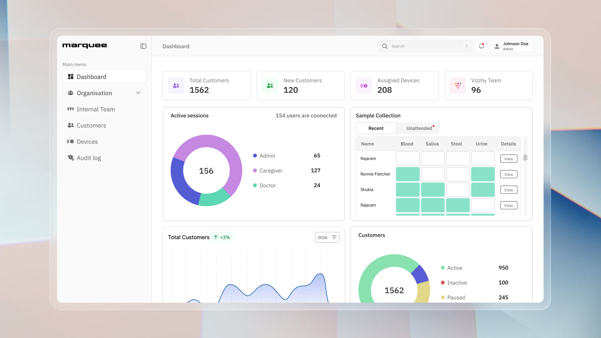
The dashboard became a single source of truth organized around dashboard, organization, internal team, customers, devices, and audit logs.
PATIENT #0248Assignment ready
Dr. RaoCONFIRMED
Summary first. Dense detail one level deeper.
Active, paused, linked, and unlinked scan instantly.
The next action sits beside the object it changes.
04 / Evidence of flow
The work moved faster because the system finally showed its state.
The final experience reduced overload, cut repeated tool switching, and gave new admins a clearer operating model.
reduction
reduced
completion rate
onboarding time
BEFOREFindCross-checkMessageWaitUpdate
AFTERSee contextActConfirmed
05 / The interface in motion
Dense operations, composed for a quick read.
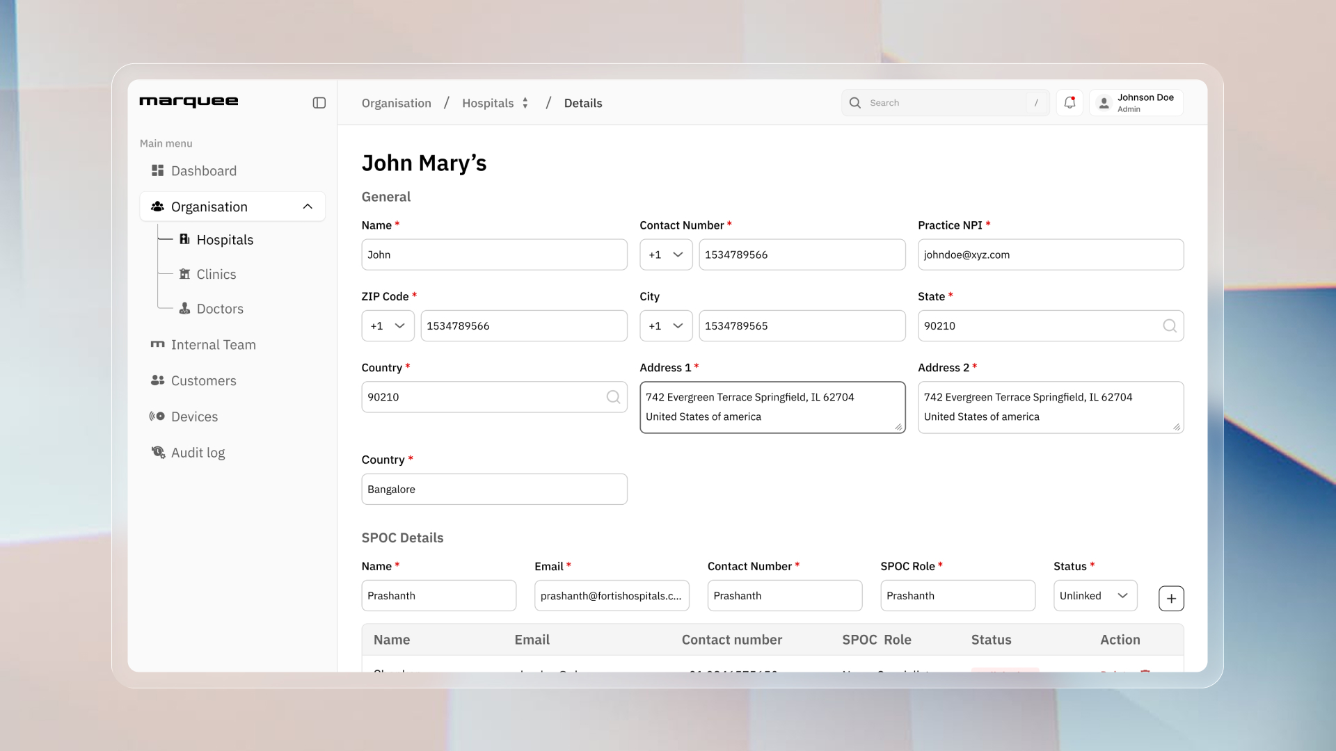
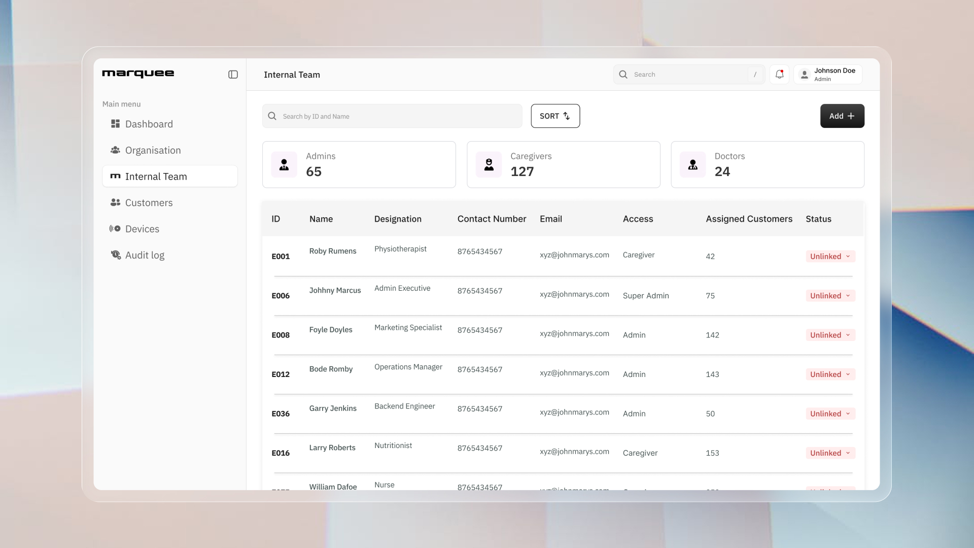
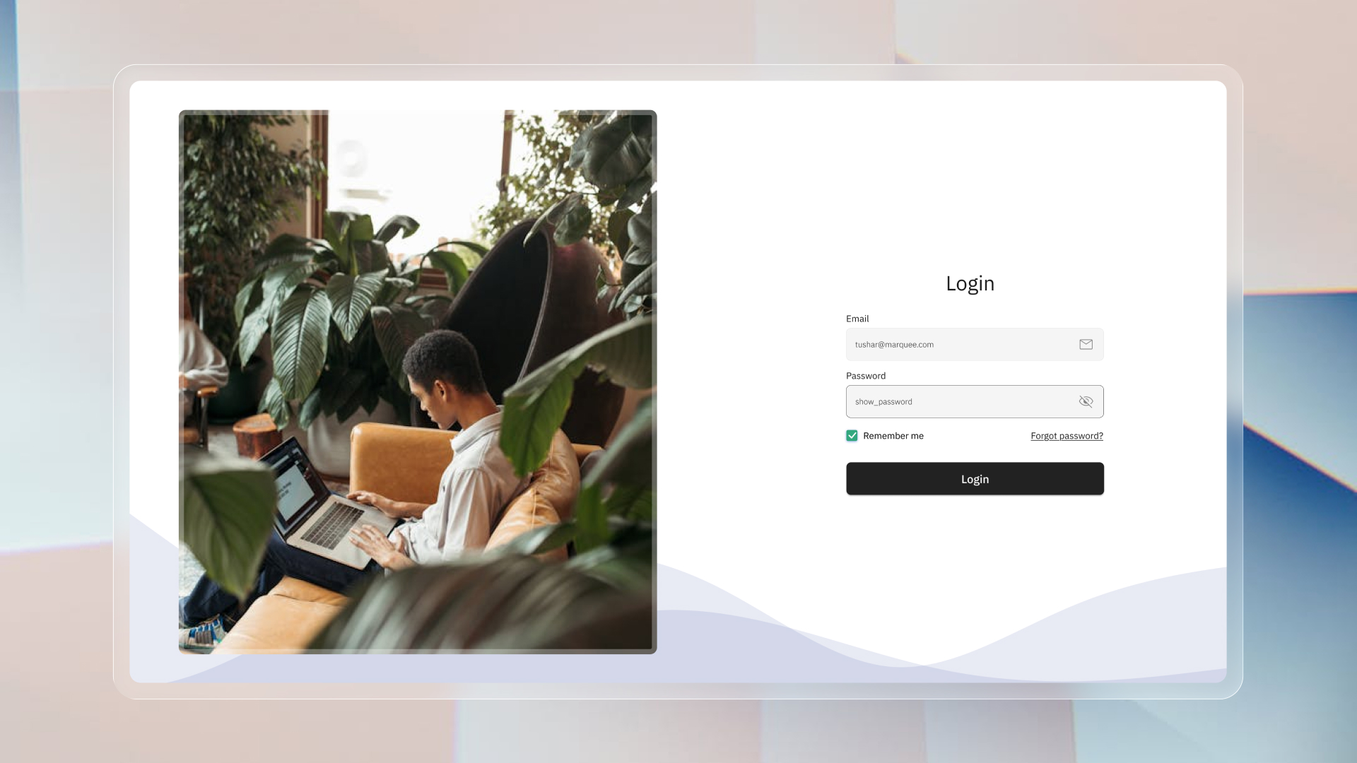
A restrained enterprise system keeps navigation, data, status, and forms clear without flattening the relationships behind the work.
The team behind the system
Solo designer. Shared operational ownership.
I led product strategy, information architecture, UX, and visual design, collaborating with two engineers and one product manager to turn the operating model into implementation-ready screens.
- 01Product strategy
Turned operational pain into measurable priorities.
- 02Information architecture
Mapped dashboard, organization, team, customer, device, and audit areas.
- 03UX + visual design
Designed assignment flows, management tables, forms, and status handling.
- 04Collaboration
Worked with two engineers and one product manager.
The next horizon
From admin dashboard to an operational intelligence layer.
Workload forecastingSaved manager viewsAudit-ready timelinesAssignment automation